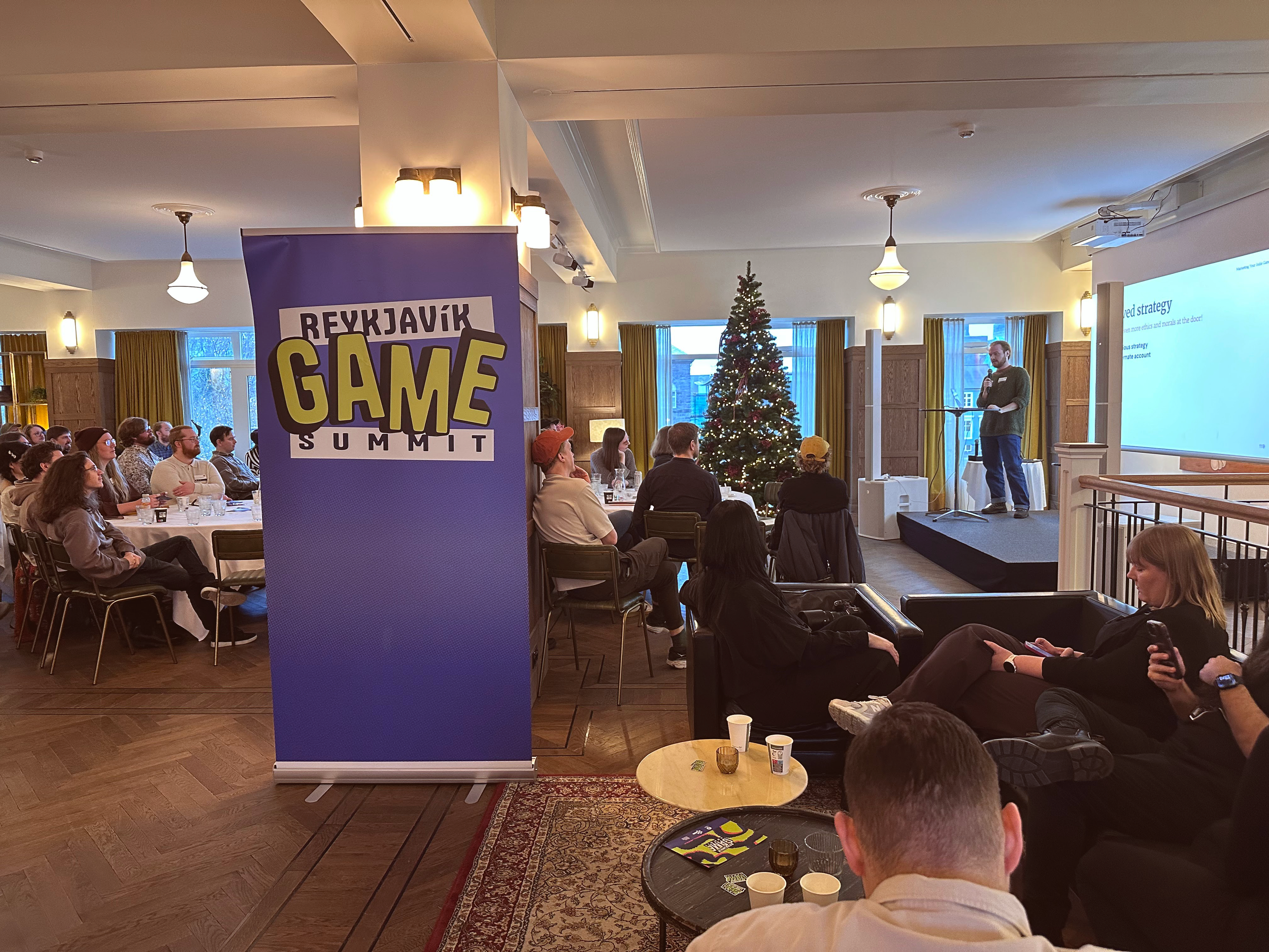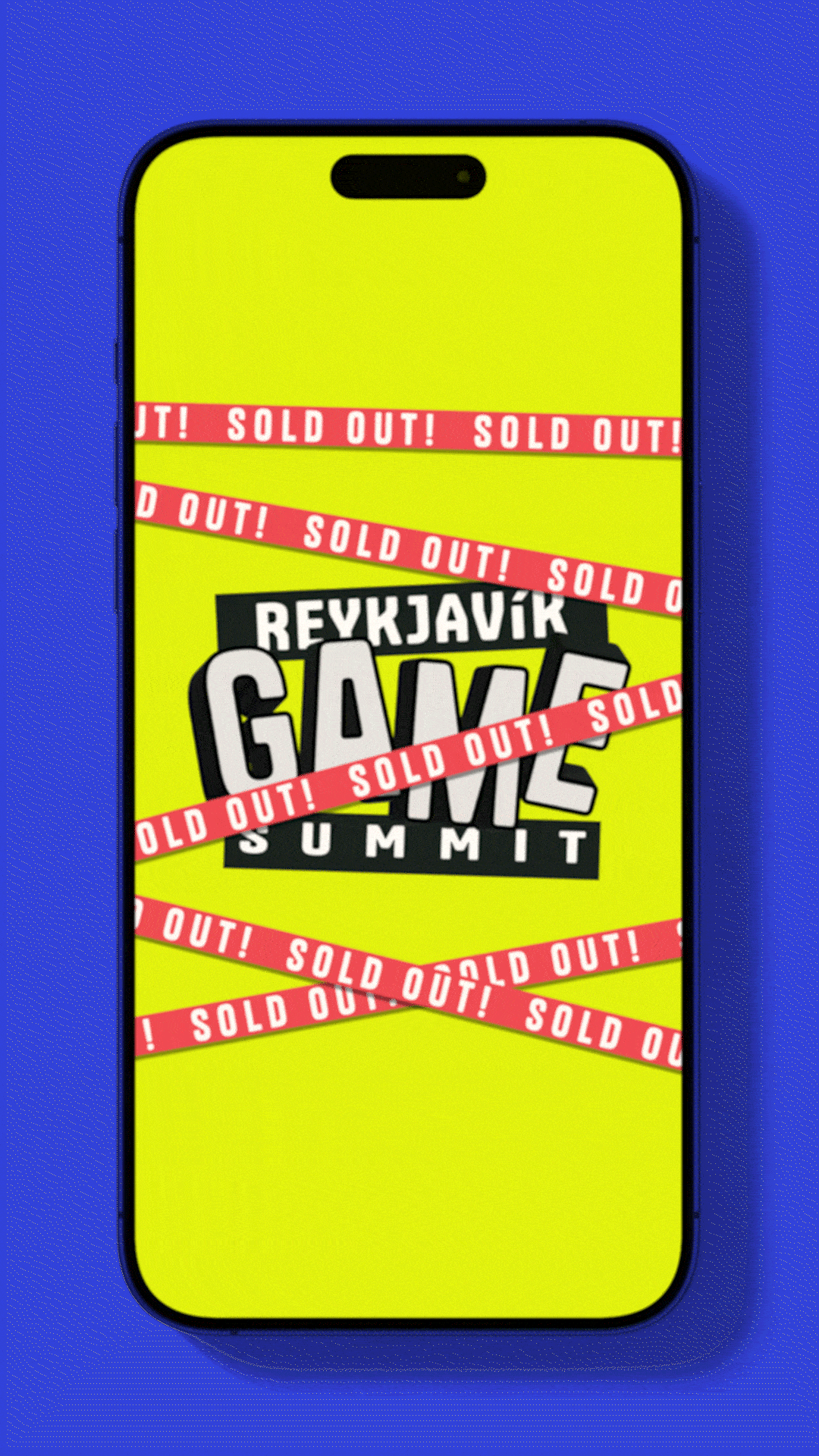

The first Icelandic industry-professional game conference launched in November 2025 and sold out two weeks in advance, welcoming over 100 attendees. The strong response is already leading to a search for a larger venue for the next one.
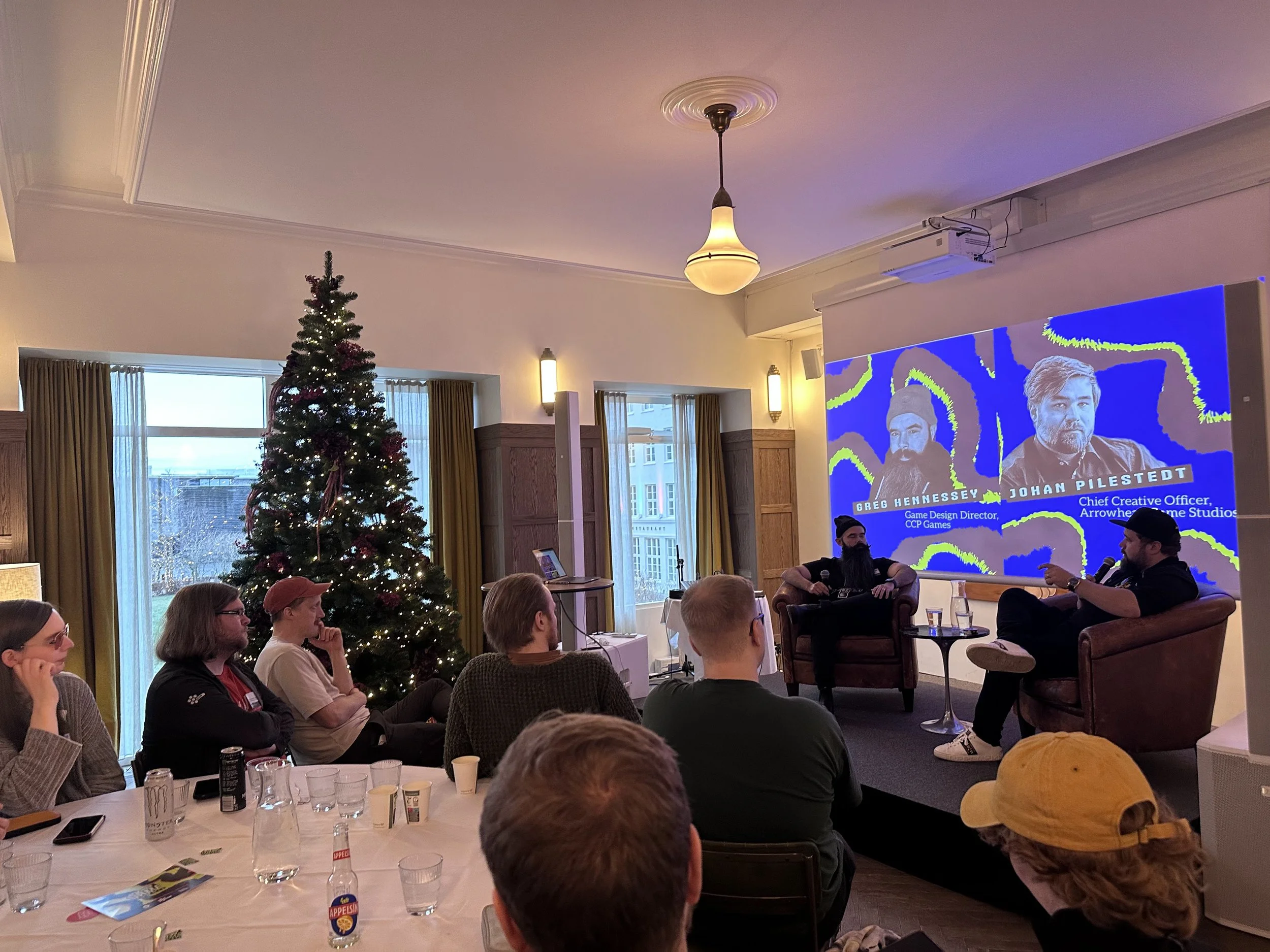
The one-day program brought together independent game designers and speakers from Arrowhead Game Studios, CCP, Epic Games, and Housemarque, positioning the event firmly within the international games industry.
My role was branding, social media and presentation design.