


Branding and visual system for a vegan, family-style restaurant and kitchen that also produces ready-made meals for retail.
The brand needed to appeal to a diverse customer base: parents, queer individuals, neurodivergent people, and those looking for accessible plant-based options. To reflect that, I created a visual language that balanced clarity with personality — using clean, legible type paired with expressive elements.
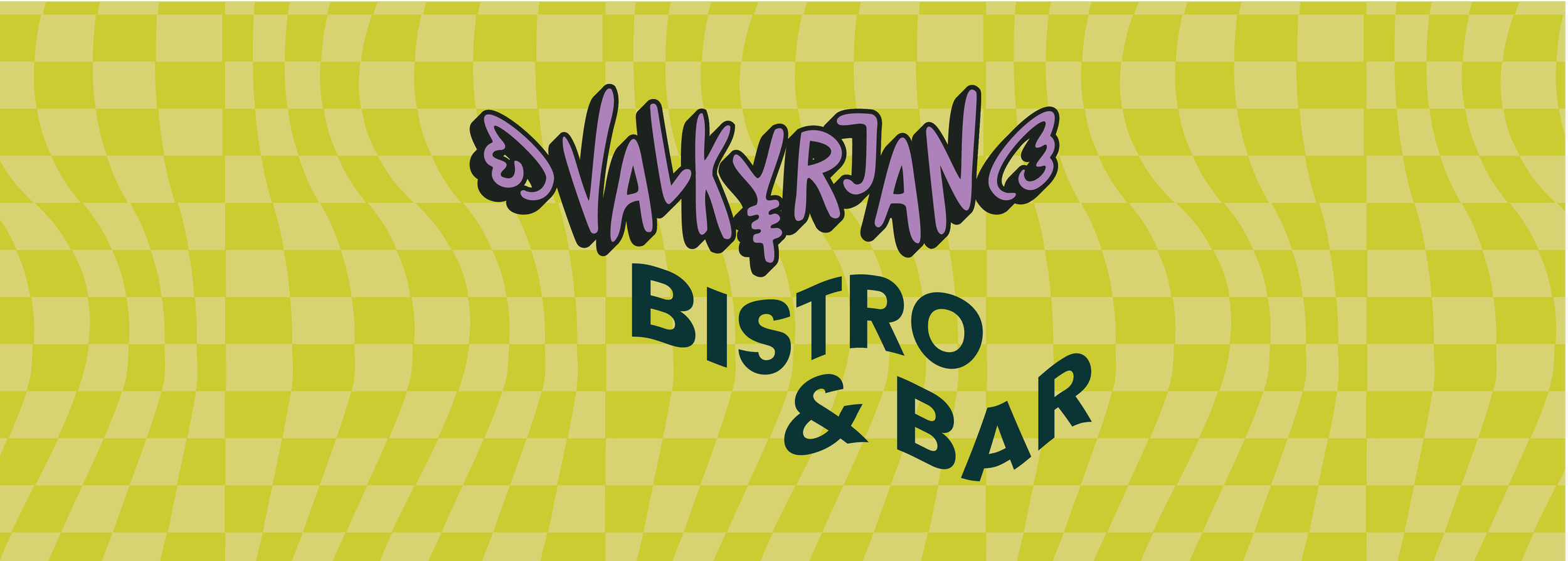
The logo was hand-drawn, incorporating a personal rune requested by the owner. She also requested purple — I paired it with lime green to create a vibrant, energetic contrast while maintaining a feeling of freshness and character.
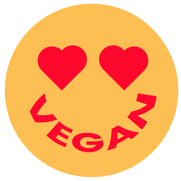
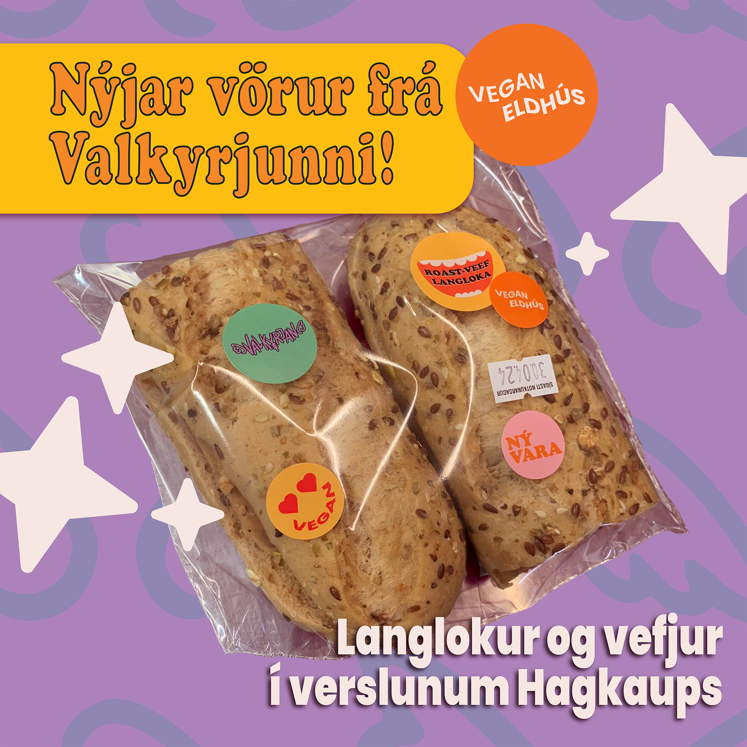
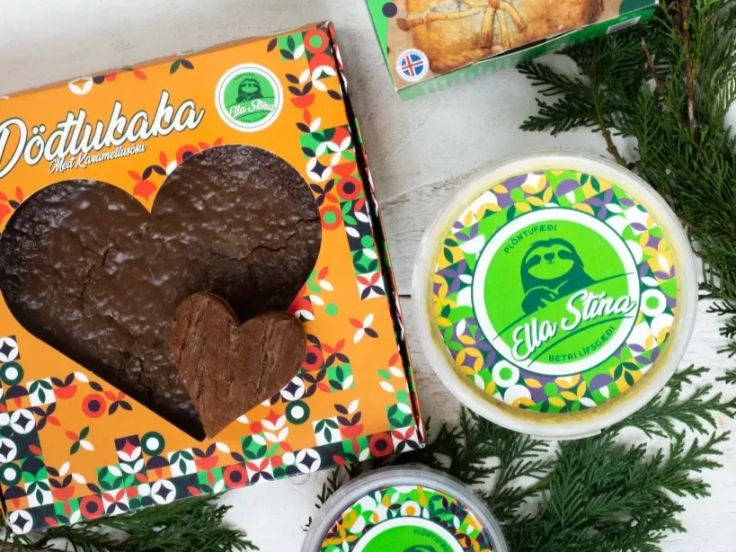
The brand direction leaned into a Y2K-inspired aesthetic, which felt both nostalgic and bold — a good fit for a company with a nonconforming spirit. While still developing the branding and testing recipes for the products that were going to be sold, I designed a few simple stickers that would be placed on the products. That way it was cheap, cohesive and easy to customize.


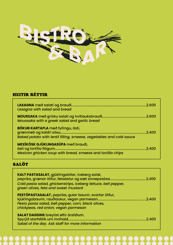

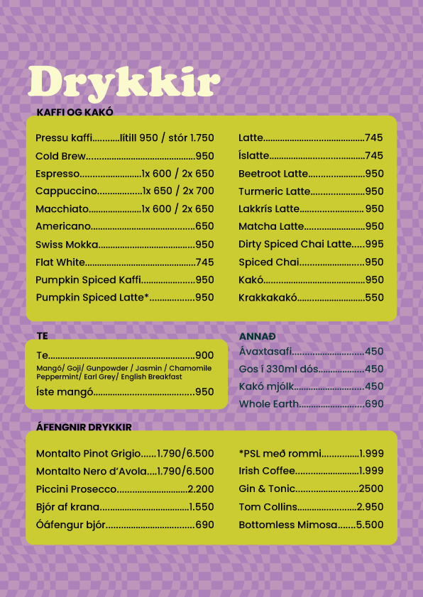


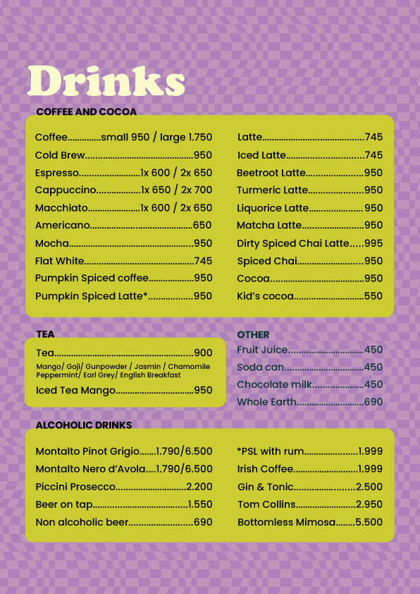

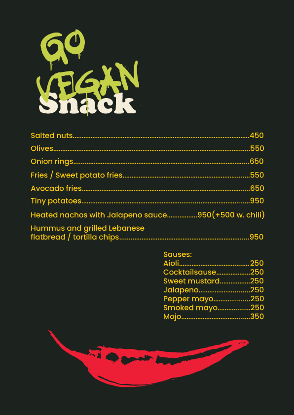

The menus. Each of them has the same color palette and fonts but set up differently. Except for the main menu (the green one), all of the menus had an Icelandic and English side.
Social media ad for a new sandwich.

Wraps that were sold in stores.

A mockup of the sauce label.
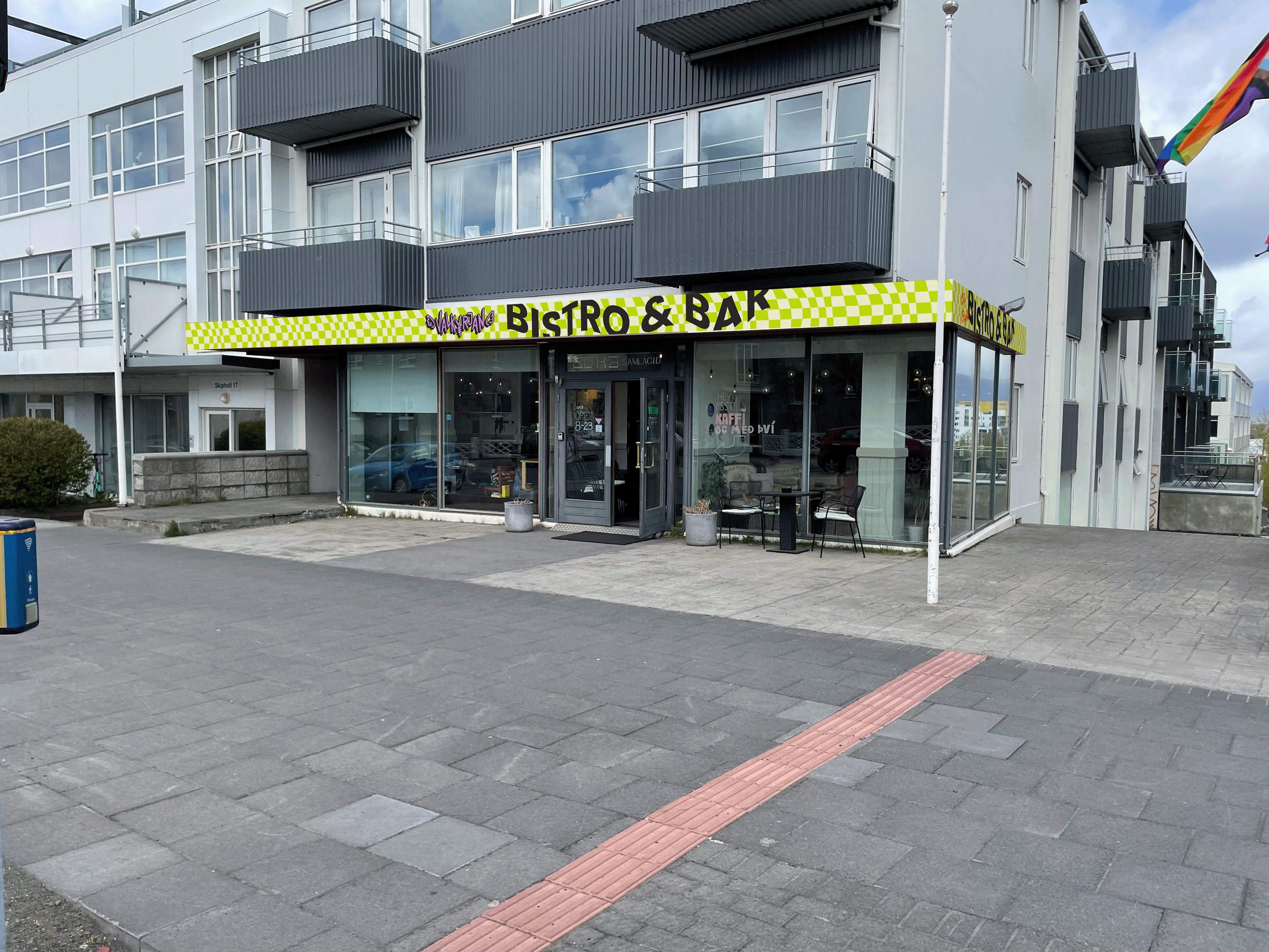
The sign outside the restaurant.
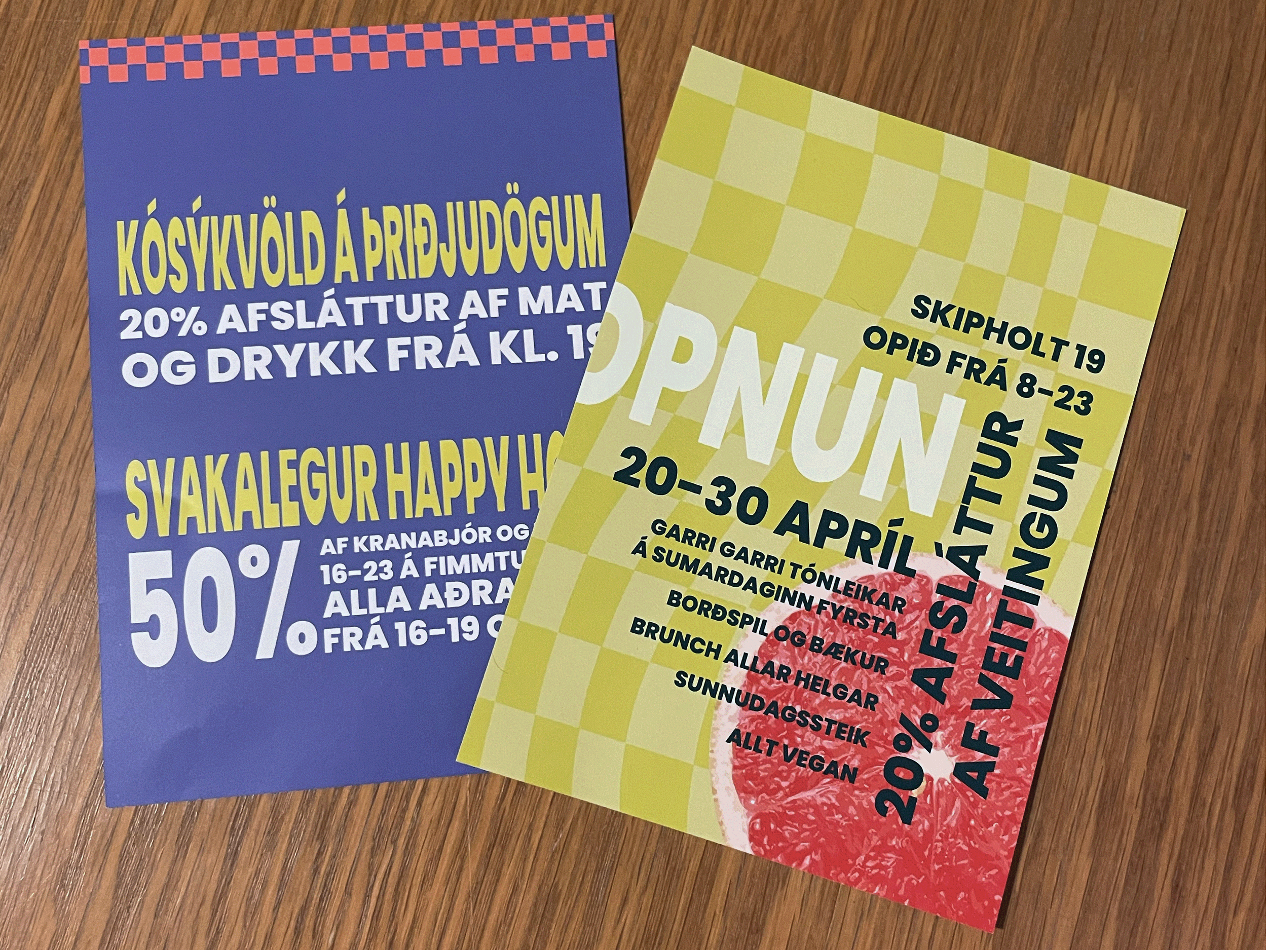
Two flyers that I designed.
Epilogue
Sadly, Valkyrjan shut its doors for legal reasons before the branding could be properly developed and tested. But two months after it shut down, its biggest competitor relaunched their visual branding and packaging.
Old design on the left, new on the right.

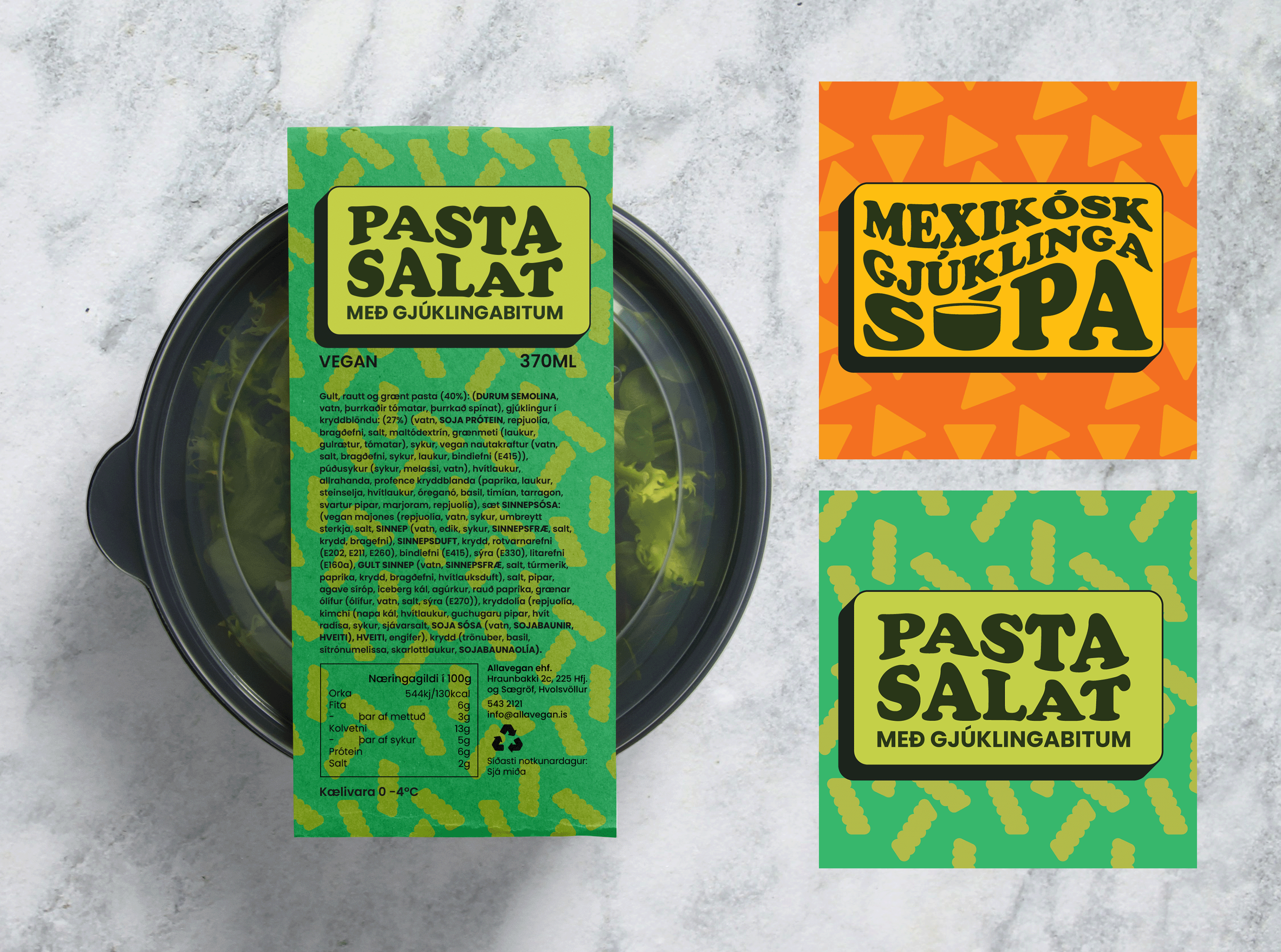
Mockups for the more permanent packaging design that never got to print. Reading the ingredients is important for those with food restrictions so we listed them all on top of the label so consumers wouldn’t have to flip it over.
I also influenced the naming of our products. Instead of chicken we sold “ghicken”, instead of ham it’s “sham”.